April 20, 2026
9 min read
Responsive design makes your booking widget fit on a phone. Mobile-first makes it work there. The gap costs restaurants more bookings than any other UX factor.
Your booking widget passes Google's mobile-friendly test. It resizes on a phone. The buttons don't overlap. You checked it once in Chrome's device toolbar, saw that nothing was broken, and moved on.
That check tells you almost nothing about whether guests can actually book a table on their phone. And the gap between "doesn't break" and "works well" is where your reservations are disappearing.
Responsive design is not mobile-first design. The difference is costing restaurants more bookings than any other single UX factor.
As of Q4 2024, mobile devices account for 62.54% of all global website traffic, up from around 60.6% at the start of that year and continuing a trend that's been climbing for a decade.
That number is not the argument. You already know most of your visitors are on phones. The argument is what happens after they arrive.
Travel and hospitality websites convert at 7.6% on desktop but only 2.6% on mobile -- a gap of nearly 3x -- according to ContentSquare's analysis of 43 billion sessions across 3,590 websites.
Read that again. Mobile drives the majority of traffic but converts at one-third the rate. Restaurants are a subset of travel and hospitality, so the exact figure will vary, but the pattern holds: the guests most likely to find you are the ones least likely to finish booking.
That gap is not evidence that people don't want to book on their phones. 59% of diners now prefer booking online, and in the US and Canada, 45% specifically prefer mobile apps for reservations -- a share that's been rising year over year.
The intent is there. The friction is in the execution.
A responsive website rearranges its layout to fit different screen sizes. Text reflows. Columns stack. Images shrink. This is the minimum baseline -- if your site doesn't do this, you have a different and more urgent problem.
But responsive design is reactive. It takes a desktop layout and adapts it downward. The content hierarchy, the number of form fields, the loading sequence, the interaction patterns -- all of these were designed with a mouse and a widescreen monitor in mind. The phone version inherits those decisions. It inherits the same number of steps. The same assumptions about patience, screen space, and connection speed.
Mobile-first design inverts that. You start with the most constrained environment -- a 6-inch screen, a thumb, a cellular connection, forty seconds of attention -- and design the experience for that context. Then you expand upward to tablet and desktop, where you have room and speed to spare.
The result is not just a different layout. It's a different set of decisions about what to ask, what to show, and what to cut.
It's 7:15 PM on a Saturday. A group chat is moving fast. Someone just said your restaurant's name. One person taps the link, and your site starts loading on their phone while they're walking between the train station and a bar. They're on 4G. They have maybe thirty seconds of intent before the group picks somewhere else.
Your homepage loads. Then the fonts. Then the hero image. Then a tracking script. Then the booking widget starts initializing. By the time the date picker renders, it's been four and a half seconds.
That guest is gone. Not because they didn't want to come -- because your site didn't let them.
Google's research established that 53% of mobile visitors leave if a page takes longer than 3 seconds to load. When load time goes from 1 second to 3 seconds, bounce probability increases 32%. From 1 to 5 seconds, it rises 90%.
But speed isn't just about not losing people. A Google and Deloitte study -- 37 brand sites, 30 million sessions, 30-day monitoring -- found that a 0.1-second improvement in mobile load time increases travel website conversion by 10.1%.
A tenth of a second. 10% more conversions. That's not a rounding error. That's the math of a booking widget that loads in 1.2 seconds versus one that loads in 1.3. Milliseconds have a direct booking value.
The broader pattern holds across e-commerce too. Portent's analysis of over 100 million page views found that sites loading in 1 second achieve 2.5x higher conversion rates than sites loading in 5 seconds.
A responsive site that loads the same heavyweight desktop assets on mobile -- full-resolution images, undeferred JavaScript, analytics payloads -- cannot compete on speed with a site built for mobile constraints from the start.
Imagine you're standing at a bar, phone in one hand, trying to book a table for four at 8 PM. The booking form asks for your first name, last name, email, phone number, party size, date, time, special occasion type, dietary requirements, how you heard about the restaurant, and whether you'd like to join the mailing list.
You're typing with one thumb. Each field is a small tax on your patience. By field seven, you're wondering whether it's faster to just call.
Baymard Institute found that the average e-commerce checkout contains 11.3 form fields but optimally needs only 8. Each unnecessary field measurably reduces completion.
The parallel to restaurant booking is direct. A booking form is a checkout flow. The minimum viable booking collects party size, date, time, name, and contact info. That's 5 fields. Everything beyond that -- occasion type, dietary notes, marketing consent, a second contact method -- is friction you're choosing to add.
On desktop, the cost of extra fields is moderate. People type fast, they can see the whole form at once, and they're usually on a stable connection. On mobile, the cost multiplies. The keyboard covers half the screen. Scrolling between fields takes effort. Auto-correct fights you. A form that takes 20 seconds on desktop takes 60 on a phone -- if the guest finishes at all.
Mobile-first design doesn't just reduce field count. It rethinks what's worth asking at the moment of booking versus what you can collect later. A guest's dietary preferences matter, but you can ask after the booking is confirmed, not during the 30-second window when they're deciding whether to commit. Understanding what guests actually expect from the booking process helps you separate the essential from the nice-to-have.
Take a mid-sized restaurant doing 250 covers per week at an average check of EUR 55, with a 10% net margin. Their booking widget gets 500 views per week, 62% from mobile.
That's 310 mobile sessions. At a 2.6% conversion rate (the travel industry mobile average), 8 of those become bookings. If the desktop portion -- 190 sessions at 7.6% -- converts 14 bookings, that's 22 total bookings from the widget per week.
Now improve mobile conversion from 2.6% to 5% by fixing load time, cutting form fields, and designing for thumb interaction. That's 15 mobile bookings instead of 8. Seven additional bookings per week. At an average party size of 2.5 and a EUR 55 average check, that's roughly EUR 960 per week in additional revenue. Over a year: nearly EUR 50,000.
At a 10% margin, that's EUR 5,000 in profit -- from design changes that cost nothing to maintain once implemented.
The booking funnel from first click to confirmed reservation is where these improvements compound. Each step that gets easier on mobile moves the conversion needle.
Here's the test most restaurants skip: open your booking page on your phone, on cellular data, not WiFi. Stand outside. Wait for it to load. Try to book a table from scratch. Time it.
Browser preview modes -- the device toolbar in Chrome -- do not reproduce what your guests experience. They simulate screen size but not cellular latency, not real touch interactions, not the way a 4G connection throttles JavaScript execution. A booking flow that works fine in a browser simulation may stall on an actual phone on a real network.
Note every moment that requires a zoom. Every field that doesn't auto-capitalize a name. Every dropdown that's hard to tap. Every second the widget spins before showing availability.
Then check your analytics. The gap between your mobile and desktop conversion rate is the single clearest measure of fixable friction. If mobile converts more than 3 percentage points below desktop, you're looking at a design problem, not a device problem.
Mobile cart abandonment currently runs 14-16 percentage points higher than desktop -- 80% on mobile versus 66% on desktop, according to Dynamic Yield's benchmark of 200 million monthly users. Baymard Institute's data puts the gap even wider.
A meaningful share of that gap is design-induced, not intent-driven. The guests who abandon on mobile wanted to book. They just couldn't finish.
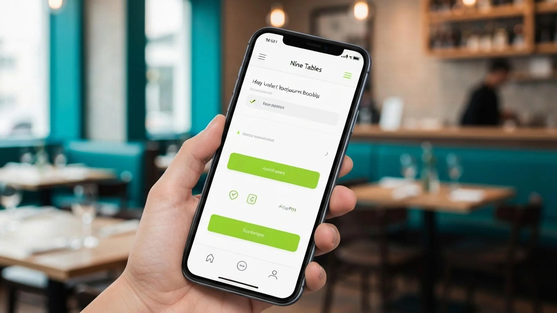
When we built the Nine Tables booking widget, we didn't start with a desktop version and add a mobile mode. The widget was designed for a phone first -- thumb-sized touch targets, minimal form fields, no loading dependencies that would stall on a cellular connection. Desktop is the version that gets extra room, not the version that gets compressed.
The result is a booking flow that completes in under 30 seconds on a phone. Not because we added speed optimizations to a desktop product, but because the entire architecture assumed the constrained environment as the default. The same thinking applies to the information your booking page needs for search visibility: content that loads fast and renders cleanly on mobile also performs better in search.
Responsive design is a technical requirement. Mobile-first design is a product decision. One ensures your booking widget doesn't break on a phone. The other ensures it actually works there -- that a guest can find a time, select it, enter their name, and confirm before the group chat moves on.
Most restaurants have the first. The ones gaining bookings have the second.
Your guests decided years ago that their phone is how they book. The question is whether your booking experience was designed for that decision, or merely adapted to it.