January 10, 2025
7 min read
65% of diners go directly to a restaurant website to book. Where you place your booking button determines whether they complete the reservation or leave.
65% of diners go directly to a restaurant's own website to make a reservation, rather than using third-party booking platforms.
That means the majority of your potential bookings start and end on your website. The question is whether those visitors find your booking button quickly enough to act on it -- or whether they leave and book somewhere else.
A Nielsen Norman Group study found that placing a call-to-action above the fold increases engagement by 84%.
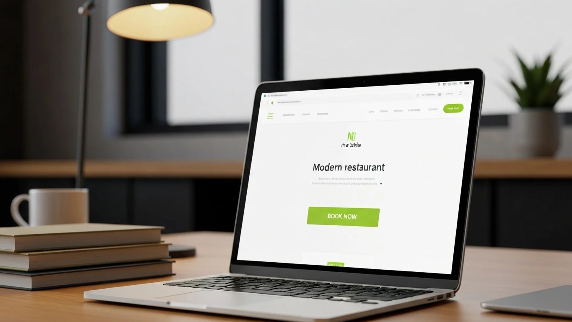
Your Book Now button is the most important element on your restaurant website. Its placement is not a design detail. It is a revenue decision.
The "fold" is the bottom edge of what is visible when a page first loads, before the visitor scrolls. If your booking button is below this line, a significant portion of visitors will never see it.
This does not mean the button should only appear above the fold. It means it must appear there first. When a potential guest lands on your site -- likely on their phone, probably hungry, possibly in a hurry -- the booking action should be visible without any scrolling.
59% of diners now prefer to book their table online. Many of them are deciding between two or three restaurants right now. If yours requires scrolling to find the reservation option, you lose to the one that does not.
A sticky button -- one that stays fixed at the bottom of the screen as the user scrolls -- keeps the booking action within thumb reach at all times. Research from Crazy Egg found that sticky CTAs increase clicks by 27%.
On mobile, this is particularly effective. The bottom of the screen is where thumbs naturally rest. A persistent booking button there means the guest never has to scroll back up, never has to search for the action, never has to think about where to go next.
CTA buttons outperform text links by 200% on mobile devices, according to Google's UX research.
For a restaurant website where the majority of traffic is mobile, a sticky bottom button is not a design flourish. It is a conversion tool.
Your booking button should appear in several places across your site:
Research shows that placing a CTA after testimonials or social proof raises conversion rates by about 25%.
All these buttons lead to the same booking flow. Multiple entry points, single destination. The goal is that no matter where a visitor is on your site, a booking action is one tap away.
The default "Book Now" is functional but not always optimal. The text on your button signals the level of commitment required. Research has shown that first-person phrasing on buttons -- "Find my table" instead of "Book now" -- can increase clicks by up to 90%.
Consider alternatives:
The right text depends on your restaurant and your audience. A casual neighbourhood bistro and a fine dining venue attract different mindsets. Test different options and measure which one produces more completed reservations.
Your booking button should visually stand out from everything around it. Adobe's UX benchmarks found that high colour contrast on CTA buttons increases visibility by 50%.
If your website uses cool tones -- blues, greys, whites -- an orange or warm-toned button draws the eye. The specific colour matters less than the contrast with its surroundings. The button should be impossible to miss on first glance.
Avoid making your booking button the same colour as your navigation, headers, or other interactive elements. If everything looks the same, nothing stands out.
On mobile, the minimum recommended touch target is 48 by 48 pixels with 16 pixels of surrounding white space. Buttons meeting this standard show 49% higher tap-through rates.
Your booking button should be:
A button that is too small frustrates mobile users. One that is too close to other elements causes mis-taps. Both increase abandonment.
45% of restaurant reservations are made for the same day. These guests are deciding in the moment. Every extra step between tapping "Book Now" and seeing available times is a potential drop-off point.
To keep the path from button to confirmation as short as possible:
Do not require account creation. A guest who wants dinner tonight will not create a username and password to book a table. Name, phone number, party size, date, and time. That is all you need.
Minimise form fields. Every additional field is friction. Ask only for what is strictly necessary to hold the reservation.
Show availability immediately. The guest tapped the button because they want to know if you have space. Show them. Do not make them fill in details before seeing times.
Make it mobile-friendly. If your booking form requires pinching, zooming, or sideways scrolling on a phone, it is costing you reservations.
When you have genuine scarcity, showing it increases conversions. Research from OptinMonster found that urgency language raises click-through rates by 14%.
For restaurants, urgency is often real:
This works because it is true. When your Saturday is nearly full, saying so helps guests act rather than deliberate. Do not fabricate scarcity -- guests recognise it, and it erodes trust.
Small improvements in button placement and design compound over time. A 10% increase in your booking conversion rate is 10% more reservations, permanently.
Test these variables one at a time:
You do not need complex A/B testing tools. Change one thing, measure reservations for two weeks, compare to the previous two weeks. The goal is more completed bookings, not a statistically perfect experiment.
Nine Tables provides an embeddable booking widget that restaurants place on their own website. The widget is designed for mobile-first use: fast loading, minimal fields, and immediate availability display. Guests see open times without creating an account, and the booking completes in under 30 seconds.
The widget works as a button, an embedded section, or a full page -- depending on how you want visitors to interact with it. Every placement option is designed to minimise the distance between "I want to eat here" and "Reservation confirmed."
Your website is where most of your bookings start. The path from first visit to completed reservation should be obvious, fast, and frictionless.
Put the button where people look. Make it impossible to miss. Remove every obstacle between the tap and the confirmation. Then measure whether more reservations come through -- and keep improving.